State / 01 · Navigation
Open
What you’re looking inside. Opening should change nothing else.
Enterprise planning · Filter system · o9
Many paths.
One scope.
No guesswork.
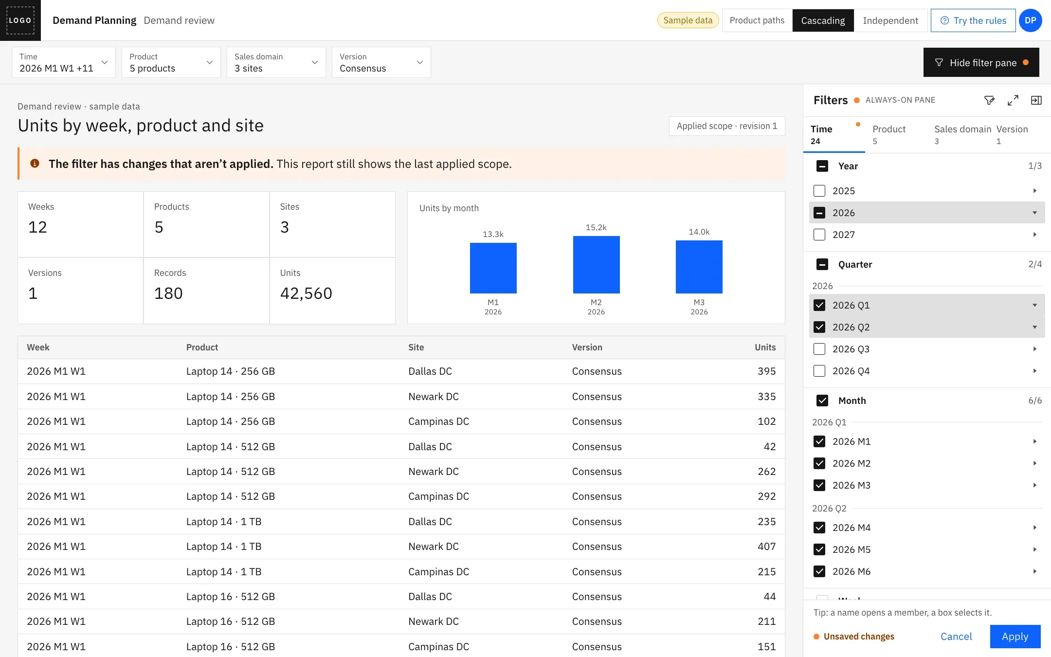
Before a planner can trust a number, they need to know what it includes. I designed the filter that stays beside the report: one draft, shown in a narrow pane and a wide expanded view, with rules that keep looking, selecting and applying apart.
Component design
Magnified × 3 · the quarter rows in the pane · drawn from the rule set
01 / Context
Planners narrow a multidimensional plan before they read it: which weeks, which products, which sites, which version.
Each dimension is a hierarchy, some can be reached by more than one path, and properties and rules narrow them further. Together they make the scope, and the scope decides what every number on the report counts.
Time 4 levels
PropertiesSeason · beginning of month
Product 2 paths
PropertiesLifecycle stage · colour
Sales domain 3 levels
CriteriaRules such as “Region in (Europe)”
Version 1 level
SimpleOne flat list, the same rules
INPUT / 01A familiar habitThe planners’ earlier tool showed hierarchies as columns. That habit shaped the expanded view.
INPUT / 02Client reviewsI walked the client’s planners and stakeholders through each round of designs.
INPUT / 03Written review notesEach round ended with a list of changes, and the interaction rules were written down there.
INPUT / 04One platform, many tenantsEvery rule had to hold in every configuration a tenant could set up.
02 / The problem
“Which weeks am I looking at?” sounds simple. The answer can depend on several years, half-selected quarters, a property, a rule, and two routes to the same products.
The classic scope filter opened in a popup, one level at a time, with the parents out of view and the report hidden behind it. To adjust the scope, a planner reopened the popup and rebuilt the picture from memory.
State / 01 · Navigation
What you’re looking inside. Opening should change nothing else.
State / 02 · Draft
What the next scope will include. A partial mark says “some of this”.
State / 03 · Applied
What the numbers use now. Only Apply should change it.
Every number
needed a double check.
UX lensRecognition over recall
A planner should read the scope off the screen, not remember the clicks that made it. Each state needed its own look, and the three had to stay in step across every view of the filter.
03 / The brief
How I framed it
Keep the filter beside the work, give it more room when the hierarchy is deep, and make both views edit the same draft. Nothing reaches the report until the planner applies it.
Beside the work
Where does my scope stand?
A narrow pane next to the report. The levels stack vertically, grouped under their parents.
Shared by both
What will the report use next?
Members, properties, criteria and the unsaved state. One draft, whichever view edits it.
Room to inspect
What exactly is in it?
The same levels side by side, with every selected member listed underneath.
Constraints
A scope you can read
before it runs.
04 / The turning point
My early expanded view carried five levels down to the day, and violet hints told people where to select. It worked, but only with the hints.
A review round turned that into a written list of changes: fewer levels, the leaf first in the grid, filters on every column, a clear way to commit, and one rule for every click. Select a change to see where it landed.
The wireframes on this page are my low-fi files, redrawn in React. Click through all 26 frames
Five levels, down to the day. Every week opened into seven more rows.
Four levels, ending at the week. The day came out of the tree and the grid.
The grid started with the day and ended with the week.
The week comes first, then its properties and its parents. Every column can be filtered.
Violet hints labelled the screen: “Selection area”, “All selected”.
The hints went. One info line stays, and the layout carries the meaning.
The notes asked for a way to apply or close the expanded view.
Cancel and Apply sit at the bottom. The draft reaches the report in one deliberate step.
From my review notesRedrawn, not a screenshotThe originals are a working list with a colleague’s name in it. These are the lines that changed the design.
“Label click is only to expand and collapse. Checkbox click is to select and expand (deselect and collapse).”
Force / 01 · Review
Levels nobody filtered by, and hints that did the explaining, came out. What stayed had to explain itself.
Force / 02 · Scale
The pane, the expanded view, alternate paths and criteria were all coming. A click had to mean the same thing in each.
The result
The name opens. The box selects and opens. Unticking deselects and closes. Apply is the only way the report changes.
05 / Three decisions
Decision / 01
A / THE ROW SELECTS
Click anywhere to selectOne big targetB / TWO SEPARATE CONTROLS
The box selects, an arrow opensSafe to browseC / THE BOX SELECTS AND OPENS
The name opens; the box selects and opensSafe to browseMore dots = better for the planner. A design judgement, not a measurement.
If the name selected, looking inside 2027 would quietly add it to the scope. So the name only opens and closes. The box selects, and opens too, so the planner sees at once what they just included. Unticking deselects and closes, so the tree shrinks back to the scope.
The trade-off: two neighbouring targets with different meanings need clear affordances, and a tick moves the layout. In a planning scope, a predictable meaning is worth more than a still tree.
Error prevention
Visible system status
The contract · from my review notesTry it in the rule bench ↓
Decision / 02
A / A POPUP
Over the reportRoom to workB / A FULL PAGE
An expanded view onlyRoom for deep treesC / PANE + EXPANDED VIEW
Beside the report, with room on demandThe report stays in viewThe third column is where the chosen option pays: two layouts of one model have to feel like one filter.
Planners check the scope while they read the plan, so the filter lives beside the report. Deep trees still need room, so the expanded view lays the same levels side by side. Both edit one draft: switching views never starts a different filter, and the unsaved state follows the planner between them.
The trade-off: the pane takes width from the report, and two layouts of one model have to stay in step, level by level and state by state.
Context continuity
Consistency
Decision / 03
A / APPLY ON EVERY CLICK
The report is the previewInstantB / APPLY, THEN CHECK
Commit firstOne reloadC / A READABLE DRAFT, THEN APPLY
Partial marks and a member gridCheck firstReloads are the platform’s cost, not only the planner’s. A design judgement, not a measurement.
A scope is quicker to check than a report is to re-run. Partial marks say which parents are only partly in, and the grid lists every selected week with its parents and properties: the slice, spelled out. Apply is the one moment the report changes, and Cancel puts the draft back.
The trade-off: two representations take space and have to agree. The grid earns its place: it’s where a planner confirms the exact slice before committing.
Visible system status
User control
Before → decision → after
The name opens. The box selects and opens.
A pane beside the report, and an expanded view on the same draft.
Make the draft readable, then Apply.
06 / The experience
01 / Look
2027 is open by its name. Its quarters show, none ticked, and the report is exactly as it was.
Browsing is safe
Open this step in the prototypeOpen a year by its name, tick a quarter, switch to the expanded view, then Apply. Switch the product paths to Independent to see the rules hold. The data is sample data.
07 / The rule bench
The contract, working. One draft drives both surfaces, and every click says which clause it triggered and what it changed.
The bench runs the rules of the rebuilt prototype: its logic is ported from the prototype’s tested rule module. Open and tick in either view, then Apply. Switch to Paths to watch a ticked product fall out of scope and say why.
Demand review · sample data
The contractThe clause that just fired is marked
08 / Beyond the happy path
The harder states appear when the scope is narrowed in more than one place at once. Each needs to explain itself and point the way back.
These states are designed in the rebuilt prototype. They follow from the rules in the original designs: a ticked member can still be out of scope, and the planner should never have to guess why.
Edge / 01 · An empty scope
Twelve weeks are ticked, but a season property rules them all out. The report says which dimension emptied it and why, instead of showing a blank table.
RecoveryChange the property or the selection, then Apply.
Edge / 02 · Ticked, but out
A product can be ticked and still fall outside the scope, because a property, a rule or the other path excludes it. The grid keeps the row and names the reason.
RecoveryTick its manufacturer, or leave it out knowingly.
Edge / 03 · A path not in use
Switching to the other path doesn’t throw a selection away. It’s kept, and the view says it isn’t part of the scope while the other path is chosen.
RecoverySwitch back, and the earlier selection returns.
A ticked member that’s out
says why.
UX lensError prevention & recovery
Every narrowing tool adds a way for a member to be ticked but out. Naming the reason next to the member turns a confusing result into a decision the planner can make.
09 / The system
Alternate paths, properties and criteria each came with their own screens. None of them was allowed its own meaning for a click.
The hardest part wasn’t any single screen. It was keeping the pane and the expanded view telling the same story while tenants switched these capabilities on in different combinations.
Tabs: both paths are in use, and one narrows the other.
A radio: one path at a time. The control says how the data behaves.
“Filter by: Manufacturer (3)” says what’s narrowing the Market product list. “Show all” lifts it.
Products the filter leaves out are listed with the reason, so a narrowed list never looks like missing data.
The same columns, grid, partial marks and Apply.
A configuration changes the route, never the rules.
Properties
Option 4 · Low-fi, rebuilt · the direction taken
Find the dimension, then its property. Grouping by dimension gives mixed controls one organising idea, and more of it is visible at once.
Verdicts are my design reading of each option, not test results. The full study has every exploration.
The invisible work
| Configuration | In the Always-On Pane | In the expanded view |
|---|---|---|
| A simple hierarchyYear → Quarter → Month → Week | Levels stacked, each under its parent | Levels as columns, selected members in a grid |
| Partial selectionSome children ticked | A partial mark on every ancestor | The same marks, and only the ticked members in the grid |
| Alternate paths, cascadingManufacturer and Market product | Path tabs, with “Filter by” naming what narrows the list | The same tabs in the dimension row |
| Alternate paths, independentOne path at a time | A radio choice | A radio inside the dimension tab |
| PropertiesSeason, lifecycle, colour… | Under the levels, for the dimension in view | A Properties tab, sections by dimension |
| CriteriaRules and expressions | The expression, read-only | The rule builder, with the expression written out |
| Unapplied changesThe draft differs from the report | A dot on the pane and the dimension tab | A status line, then Cancel or Apply |
Design verification, not user testing: compiled from the original designs and my notes, and rebuilt in the prototype.
One-image summary
Read the plan
↓Open the scope popup
↓Pick one level at a time
↓Remember the parents
↓Apply and close
↓Reopen to check · is this the slice?Read the plan, pane beside it
↓Open by name, tick to select
↓Read the partial marks
↓Check the grid in the expanded view
↓Narrow with paths, properties, rules
↓Apply once · the report says what it usesWhat changed
One meaning for every click, written down and applied on every surface.
A pane beside the report and an expanded view, sharing one draft.
Paths, properties and criteria that follow the same rules.
Shipped, and now part of the o9 platform for all tenants.
What I can say
The original designs and my review notes show the rules, the two surfaces and the configurations. The Always-On Pane shipped and became part of the o9 platform for all tenants, and the UI-scalability work it belonged to received a Business Milestone award.
What I don’t claim
Measured changes in planning speed, errors or adoption. The client stays anonymous. The prototype is a rebuild with invented data, and it’s labelled that way.
10 / Looking back
The review round that removed the day, and the hints, made the screen clearer than any hint did.
Paths, properties and criteria each arrived later, into rules that already existed.
Next, I’d test whether planners can predict the scope before they apply it, then how fast they get there.
A good filter narrows the data.A great one makes it trustworthy.